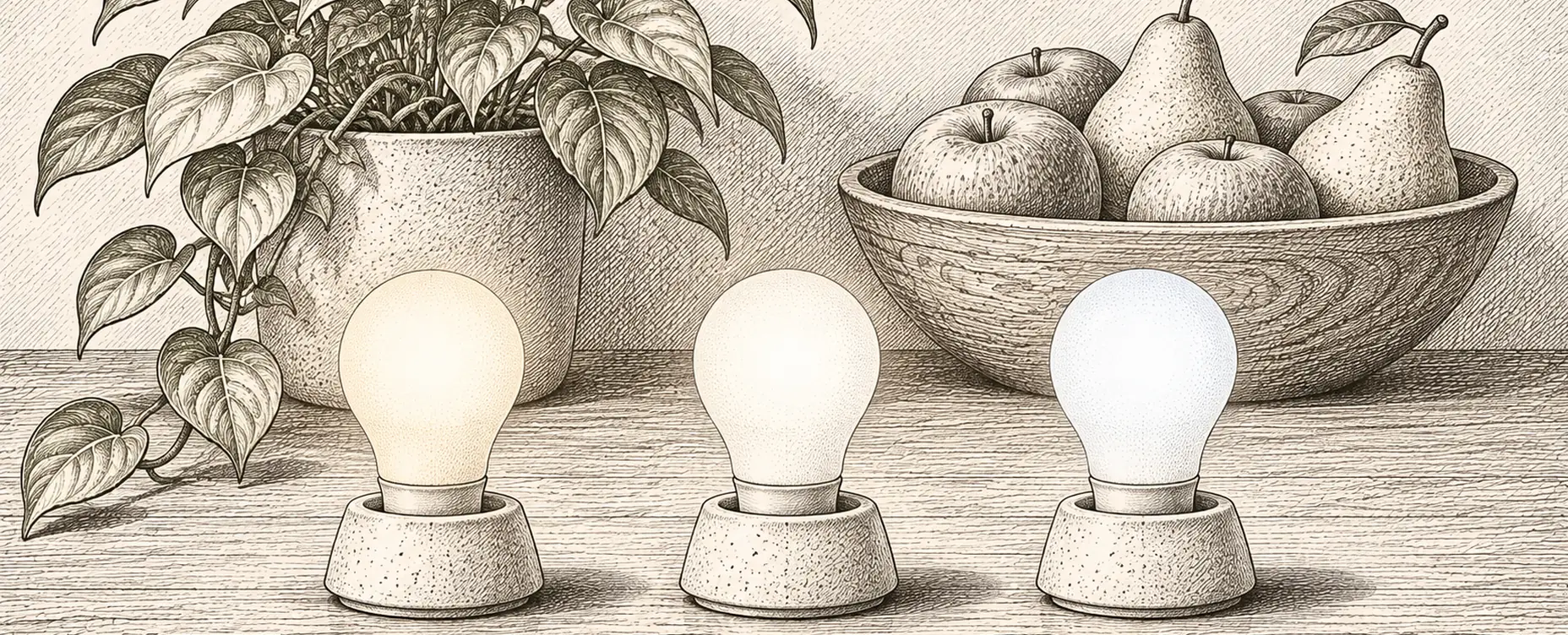
A great many people replaced their incandescent bulbs with LEDs, decided their home felt colder and less pleasant, and never worked out why. The reason is almost always one of three numbers on the box, and once you know what they mean the problem is straightforward to fix.
Here is what actually determines whether a light looks good.
Colour temperature: the number that sets the mood
Measured in kelvin, confusingly inverted: lower numbers are warmer and more orange, higher numbers cooler and bluer. It describes the colour of the light, not its brightness.
- 1,800–2,200 K: candlelight, very warm. Lovely for ambient and accent lighting in the evening.
- 2,400–2,700 K: traditional incandescent. This is what most people mean by “normal” light at home, and what living rooms and bedrooms want.
- 3,000 K: warm white, slightly crisper. Suits kitchens and bathrooms.
- 4,000 K: neutral white. Offices, workshops, utility spaces. In a living room it reads as institutional.
- 5,000–6,500 K: daylight white to cool blue-white. Task-specific. In a home it looks clinical to most European and North American eyes.
If your LEDs feel wrong, this is the first thing to check. A great many cheap bulbs are 4,000 K or higher because cool LEDs are marginally more efficient and look brighter on a shelf. In a domestic room they look wrong for reasons people feel but cannot name.
Worth noting that cultural preference varies genuinely: warm 2,700 K is the norm across much of Europe, while cooler domestic lighting is normal in parts of Asia. There is no objectively correct answer, only what suits you.
Colour rendering: the number nobody checks
This is the one that most often explains “the light is fine but everything looks dull”.
CRI — colour rendering index — scores from 0 to 100 how faithfully a light source renders colours compared with a reference. Sunlight and incandescent bulbs sit at or near 100. A poor LED might be 70.
Low CRI makes skin look grey, wood look flat, food look unappetising and reds in particular look muddy, because the specific weakness of most white LEDs is deep red rendering.
What to look for: CRI 90 or above for anywhere you spend time, look at yourself, cook, or care how things look. CRI 80 is acceptable for a cupboard or a garage. If a bulb does not state a CRI figure at all, assume it is not good, because manufacturers advertise it when it is.
For the more particular: R9 is the sub-score for deep red specifically, and it is where cheap high-CRI-claiming LEDs fall down. A bulb with CRI 90 and R9 above 50 renders skin and food noticeably better than one with CRI 90 and R9 near zero. Few consumer bulbs publish it; the ones that do are usually worth buying.
Lumens, not watts
Watts measure electricity consumed. Lumens measure light produced, and that is what you want.
Rough equivalents for the incandescent bulbs people still think in:
- 40 W ≈ 450 lumens
- 60 W ≈ 800 lumens
- 75 W ≈ 1,100 lumens
- 100 W ≈ 1,600 lumens
Two complications. First, smart bulbs are often dimmer than plain LEDs of the same size, because the radio, the driver and the colour LEDs take up space and generate heat inside the same envelope. A smart bulb claiming 60 W equivalence frequently produces less light than a plain LED making the same claim, and the difference is noticeable in a room lit by a single fitting.
Second, colour output is much lower than white output. A bulb producing 800 lumens of warm white may produce a small fraction of that in deep blue. Colour is for effect, not for illumination.
Beam angle, which decides where the light goes
Overlooked, and it determines whether a fitting works.
A standard bulb throws light in most directions. A spotlight concentrates it into a cone, described in degrees: a narrow 25-degree beam for accent lighting, a wide 60-degree or more for general illumination.
Get this wrong and you get scalloped pools of light on a wall with darkness between, or a narrow spot lighting a coffee table and nothing else. In downlights, beam angle and spacing together determine whether a ceiling produces even light or a series of hot spots — and this is the commonest failure in kitchen lighting schemes.
Flicker, which you may not see but can feel
All mains-powered lighting fluctuates to some degree. Good drivers smooth it; cheap ones do not.
Some people are sensitive to flicker they cannot consciously see, reporting headaches, eye strain and fatigue, and there is reasonable evidence linking poor-quality flicker to these effects. It also causes banding in video — noticeable if you appear on video calls.
Two practical tests you can do in a shop. Point a phone camera at the light and look for banding on screen. Or wave your hand quickly in front of it: distinct multiple images rather than a smooth blur indicates significant flicker.
Flicker often gets worse when dimmed, which is where a mismatch between bulb and dimmer shows up. Some products publish a flicker metric; most do not, which makes the phone test genuinely useful.
Dim-to-warm, and why it matters
An incandescent bulb turns orange as you dim it, because you are literally cooling the filament. That behaviour is deeply familiar and it is a large part of why dimmed traditional light feels cosy.
A basic LED dims while keeping the same colour temperature, so a dimmed 2,700 K LED is simply a dimmer 2,700 K light — and it can feel oddly grey.
Dim-to-warm LEDs replicate the incandescent behaviour, shifting towards 1,800 K or so at low output. For living rooms and bedrooms this makes more difference to how a room feels in the evening than almost any other single specification, and it is the feature we would prioritise over colour.
Tuneable white bulbs can do the same thing under automation, which is one of the better arguments for smart lighting: a rule that lowers colour temperature as it lowers brightness through the evening.
Colour, honestly
Full-colour bulbs are fun and most households use them far less than they expected.
Where colour genuinely earns its place: signalling, which is a genuinely good use — a lamp turning amber because a door is unlocked or blue because rain is forecast; accent and mood lighting behind a television or up a wall; occasional use for parties and holidays; and very warm low-level light at night, since some people find deep amber less disruptive for a night-time trip to the bathroom.
Where it does not: as the main light in a room you live in.
Our suggestion is to buy tuneable white with high CRI for most fittings, and colour only where you have a specific reason. Tuneable white bulbs are cheaper, brighter and usually better at rendering colour than the full-colour equivalents, because they are not sacrificing space and efficiency for red, green and blue emitters.
What we would buy
- 2,700 K for living spaces and bedrooms, 3,000 K for kitchens and bathrooms, 4,000 K only for workshops and utility areas.
- CRI 90 or better anywhere you spend time, and look for a published R9 figure.
- Dim-to-warm or tuneable white in rooms used in the evening.
- Enough lumens, remembering smart bulbs usually under-deliver against their claimed equivalence.
- The right beam angle for the fitting, and sensible downlight spacing.
- Check for flicker with a phone camera before buying a dozen.
- Colour only where there is a reason, and tuneable white everywhere else.
If you change one thing, make it CRI. It is the specification that most reliably explains why a technically well-lit room still feels unpleasant, and it is the one almost nobody looks at.